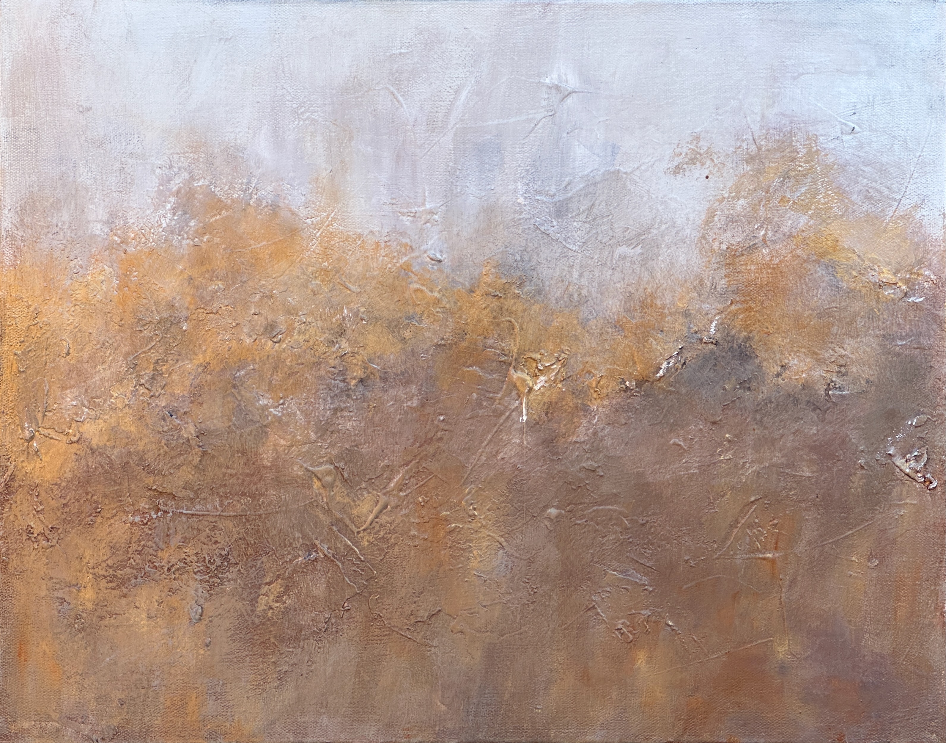
Creating Goldentide was one of the most fun painting experiences I’ve had lately. I used Jacquard Pearl-Ex Pigments Series III, in the Mink, Sunset Gold, and Pearl White colors. I also used Liquitex Basics Gold. The base colors included a warm brown created with neutral gray N6, a touch of diarylide yellow, and white as well as (of course) titanium white and shading gray.
If I could, I would put some metallic or pearl on every painting I create.
Wait a minute, I can do that! I have commented to friends while visiting galleries, “it’s so cool to see different artists… you see that you can do whatever you want with art.”
It’s fun to figure out my style. While I have at least fifteen paintings ready to post here in my portfolio, this was the first I chose. Why? What about it do I love so much?
- The neutral-ish color scheme. My boyfriend commented that he likes brighter and bolder colors compared to my typical neutrals. I am happiest with desaturated colors. The warm brown that dominates the painting makes me happy.
- The multiple gradations and layers of colors. You can see some darkness around the horizon line. I used shading gray and neutral gray underneath other layers to get that effect.
- The texture. This canvas went through many iterations before arriving here. It has always looked something like an ocean… or maybe hills with golden trees?
- Plenty of off white. My favorite paintings have a chromatic white (i.e., a not-quite-white) in them in abundance.
- The abstract landscape composition. There’s so much interest you can create with these, with texture, color, metallics, and multiple layers. I like pure abstracts also but landscapes feel the most like my style.
Here’s a look at the texture on the piece:
